Balancing Mise en scene
1. Stills from existing media that demonstrate the following:
a. A still showing how contrast is used to guide the viewer's attention:
Bridgerton, 2020
A series of unfortunate events, 2017
C. A still showing how size is used to guide the viewer's attention
Ant-Man, 2015
d. A still showing how frontality is used to guide the viewer's attention
Bridgerton, 2020
2. Stills you create that demonstrate the following:
- A still showing how contrast is used to guide the viewer's attention.
b. A still showing how color is used to guide the viewer's attention.
c. A still showing how size is used to guide the viewer's attention
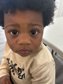
d. A still showing how frontality is used to guide the viewer's attention
3. I have came across a lot of challenges while creating these photos. For instance, I was struggling to find any object that is available for me to take a picture of that represented contrast. Although I’m not completely positive if the stuffed toy dog represents the best contrast, but the color of his fur, which is the bright white contrasts with the dark black through the plush dog body. Another instance was finding objects to represent size. I decided to look around the room I was in when I came across a Lego set with the perfect tiny plastic bunny. It was then that I realized that if I put this miniature Lego figure next to a daily used item that is normal sized in my hand, then the size of the bunny will automatically make the lotion bottle seem much bigger attracting our attention to the lotion bottle quicker than the plastic toy bunny. Moreover, it wasn’t enough to simply consider the size of objects because I had to also put the color and contrast into consideration and how it interacted with the objects. Like the vibrant colored sweater amongst the dark, black colored jackets allowed the hue of the jacket to stand out much more than usual and dims down the contrast of the black jackets, drawing more attention to the colorful sweater.


.jpeg)


No comments:
Post a Comment